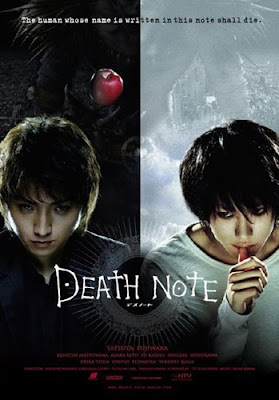
This poster of the movie Death Note is a good example of many different elements of design. This image is visually appealing thanks to the unity it has with the colors and shapes. The eye moves threw the whole image easily, but now to quickly because of the different shapes and textures of the different elements. This image is almost symmetrical and has and even distribution of visual weight. The colors in the image contrast making the elements in the image move visible and making lines clearer. This poster of the movie Death Note has many good examples of the different elements of design and art.
No comments:
Post a Comment